Multi Y Axis with twinx Matplotlib
In this Matplotlib tutorial, we're going to cover how we can have multiple Y axis on the same subplot. In our case, we're interested in plotting stock price and volume on the same graph, and same subplot.
To do this, first we need to define a new axis, but this axis will be a "twin" of the ax2 x axis.
ax2v = ax2.twinx()
That's enough to create the axis. We do ax2v because this axis is like ax2+volume.
Now, where we define the plotting on axis, we'll add a:
ax2v.fill_between(date[-start:],0, volume[-start:], facecolor='#0079a3', alpha=0.4)
We're filling between 0 and the current folume, giving it a blue-ish face color, then giving it an alpha. We want to apply an alpha just in case the volume winds up covering over something else, so that we can still see both elements.
So, up to this point, our code would be:
import matplotlib.pyplot as plt
import matplotlib.dates as mdates
import matplotlib.ticker as mticker
from matplotlib.finance import candlestick_ohlc
from matplotlib import style

import numpy as np
import urllib
import datetime as dt

style.use('fivethirtyeight')
print(plt.style.available)

print(plt.__file__)

MA1 = 10
MA2 = 30

def moving_average(values, window):
    weights = np.repeat(1.0, window)/window
    smas = np.convolve(values, weights, 'valid')
    return smas

def high_minus_low(highs, lows):
    return highs-lows


def bytespdate2num(fmt, encoding='utf-8'):
    strconverter = mdates.strpdate2num(fmt)
    def bytesconverter(b):
        s = b.decode(encoding)
        return strconverter(s)
    return bytesconverter


def graph_data(stock):

    fig = plt.figure()
    ax1 = plt.subplot2grid((6,1), (0,0), rowspan=1, colspan=1)
    plt.title(stock)
    plt.ylabel('H-L')
    ax2 = plt.subplot2grid((6,1), (1,0), rowspan=4, colspan=1, sharex=ax1)
    plt.ylabel('Price')
    ax2v = ax2.twinx()

    ax3 = plt.subplot2grid((6,1), (5,0), rowspan=1, colspan=1, sharex=ax1)
    plt.ylabel('MAvgs')


    stock_price_url = 'http://chartapi.finance.yahoo.com/instrument/1.0/'+stock+'/chartdata;type=quote;range=1y/csv'
    source_code = urllib.request.urlopen(stock_price_url).read().decode()
    stock_data = []
    split_source = source_code.split('\n')
    for line in split_source:
        split_line = line.split(',')
        if len(split_line) == 6:
            if 'values' not in line and 'labels' not in line:
                stock_data.append(line)


    date, closep, highp, lowp, openp, volume = np.loadtxt(stock_data,
                                                          delimiter=',',
                                                          unpack=True,
                                                          converters={0: bytespdate2num('%Y%m%d')})

    x = 0
    y = len(date)
    ohlc = []

    while x < y:
        append_me = date[x], openp[x], highp[x], lowp[x], closep[x], volume[x]
        ohlc.append(append_me)
        x+=1

    ma1 = moving_average(closep,MA1)
    ma2 = moving_average(closep,MA2)
    start = len(date[MA2-1:])

    h_l = list(map(high_minus_low, highp, lowp))


    ax1.plot_date(date[-start:],h_l[-start:],'-')
    ax1.yaxis.set_major_locator(mticker.MaxNLocator(nbins=4, prune='lower'))


    candlestick_ohlc(ax2, ohlc[-start:], width=0.4, colorup='#77d879', colordown='#db3f3f')


    ax2.yaxis.set_major_locator(mticker.MaxNLocator(nbins=7, prune='upper'))
    ax2.grid(True)

    bbox_props = dict(boxstyle='round',fc='w', ec='k',lw=1)

    ax2.annotate(str(closep[-1]), (date[-1], closep[-1]),
                 xytext = (date[-1]+4, closep[-1]), bbox=bbox_props)

##    # Annotation example with arrow
##    ax2.annotate('Bad News!',(date[11],highp[11]),
##                 xytext=(0.8, 0.9), textcoords='axes fraction',
##                 arrowprops = dict(facecolor='grey',color='grey'))
##
##
##    # Font dict example
##    font_dict = {'family':'serif',
##                 'color':'darkred',
##                 'size':15}
##    # Hard coded text
##    ax2.text(date[10], closep[1],'Text Example', fontdict=font_dict)
    ax2v.fill_between(date[-start:],0, volume[-start:], facecolor='#0079a3', alpha=0.4)


    ax3.plot(date[-start:], ma1[-start:], linewidth=1)
    ax3.plot(date[-start:], ma2[-start:], linewidth=1)

    ax3.fill_between(date[-start:], ma2[-start:], ma1[-start:],
                     where=(ma1[-start:] < ma2[-start:]),
                     facecolor='r', edgecolor='r', alpha=0.5)

    ax3.fill_between(date[-start:], ma2[-start:], ma1[-start:],
                     where=(ma1[-start:] > ma2[-start:]),
                     facecolor='g', edgecolor='g', alpha=0.5)

    ax3.xaxis.set_major_formatter(mdates.DateFormatter('%Y-%m-%d'))
    ax3.xaxis.set_major_locator(mticker.MaxNLocator(10))
    ax3.yaxis.set_major_locator(mticker.MaxNLocator(nbins=4, prune='upper'))

    for label in ax3.xaxis.get_ticklabels():
        label.set_rotation(45)


    plt.setp(ax1.get_xticklabels(), visible=False)
    plt.setp(ax2.get_xticklabels(), visible=False)
    plt.subplots_adjust(left=0.11, bottom=0.24, right=0.90, top=0.90, wspace=0.2, hspace=0)
    plt.show()


graph_data('GOOG')
This gives us:
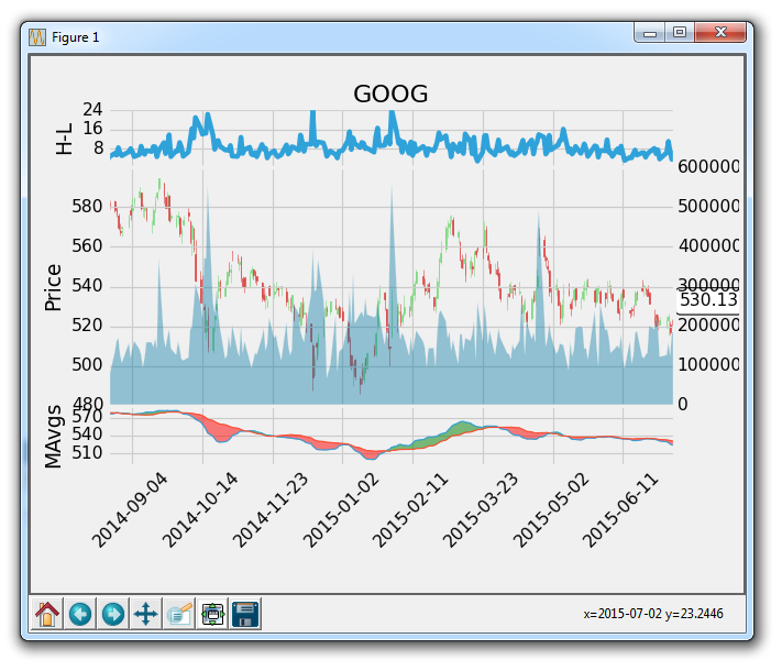
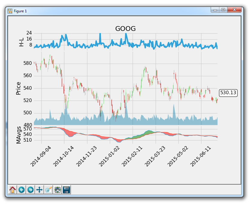
Great, so far so good. Next, we might want to remove the labels on the new y axis, and then we also might want to not have the volume taking up so much space. No problem:
First:
ax2v.axes.yaxis.set_ticklabels([])
The above sets the y tick labels to an empty list, so there wont be any.
Next, we might want to set the grid to false so there aren't double grids on one axis:
ax2v.grid(False)
Finally, to handle for the volume taking up so much space, we can do something like:
ax2v.set_ylim(0, 3*volume.max())
So this is setting the y axis to show a range from 0 to the 3 times the maximum value of the volume. This means, at most, volume can take up 33% of the graph at the highest point. So, the more you increase the multiple of the volume.max, the smaller / less space.
Now, our graph is:
The final code up to this point:
import matplotlib.pyplot as plt
import matplotlib.dates as mdates
import matplotlib.ticker as mticker
from matplotlib.finance import candlestick_ohlc
from matplotlib import style

import numpy as np
import urllib
import datetime as dt

style.use('fivethirtyeight')
print(plt.style.available)

print(plt.__file__)

MA1 = 10
MA2 = 30

def moving_average(values, window):
    weights = np.repeat(1.0, window)/window
    smas = np.convolve(values, weights, 'valid')
    return smas

def high_minus_low(highs, lows):
    return highs-lows


def bytespdate2num(fmt, encoding='utf-8'):
    strconverter = mdates.strpdate2num(fmt)
    def bytesconverter(b):
        s = b.decode(encoding)
        return strconverter(s)
    return bytesconverter


def graph_data(stock):

    fig = plt.figure()
    ax1 = plt.subplot2grid((6,1), (0,0), rowspan=1, colspan=1)
    plt.title(stock)
    plt.ylabel('H-L')
    ax2 = plt.subplot2grid((6,1), (1,0), rowspan=4, colspan=1, sharex=ax1)
    plt.ylabel('Price')
    ax2v = ax2.twinx()

    ax3 = plt.subplot2grid((6,1), (5,0), rowspan=1, colspan=1, sharex=ax1)
    plt.ylabel('MAvgs')


    stock_price_url = 'http://chartapi.finance.yahoo.com/instrument/1.0/'+stock+'/chartdata;type=quote;range=1y/csv'
    source_code = urllib.request.urlopen(stock_price_url).read().decode()
    stock_data = []
    split_source = source_code.split('\n')
    for line in split_source:
        split_line = line.split(',')
        if len(split_line) == 6:
            if 'values' not in line and 'labels' not in line:
                stock_data.append(line)


    date, closep, highp, lowp, openp, volume = np.loadtxt(stock_data,
                                                          delimiter=',',
                                                          unpack=True,
                                                          converters={0: bytespdate2num('%Y%m%d')})

    x = 0
    y = len(date)
    ohlc = []

    while x < y:
        append_me = date[x], openp[x], highp[x], lowp[x], closep[x], volume[x]
        ohlc.append(append_me)
        x+=1

    ma1 = moving_average(closep,MA1)
    ma2 = moving_average(closep,MA2)
    start = len(date[MA2-1:])

    h_l = list(map(high_minus_low, highp, lowp))


    ax1.plot_date(date[-start:],h_l[-start:],'-')
    ax1.yaxis.set_major_locator(mticker.MaxNLocator(nbins=4, prune='lower'))


    candlestick_ohlc(ax2, ohlc[-start:], width=0.4, colorup='#77d879', colordown='#db3f3f')


    ax2.yaxis.set_major_locator(mticker.MaxNLocator(nbins=7, prune='upper'))
    ax2.grid(True)

    bbox_props = dict(boxstyle='round',fc='w', ec='k',lw=1)

    ax2.annotate(str(closep[-1]), (date[-1], closep[-1]),
                 xytext = (date[-1]+5, closep[-1]), bbox=bbox_props)

##    # Annotation example with arrow
##    ax2.annotate('Bad News!',(date[11],highp[11]),
##                 xytext=(0.8, 0.9), textcoords='axes fraction',
##                 arrowprops = dict(facecolor='grey',color='grey'))
##
##
##    # Font dict example
##    font_dict = {'family':'serif',
##                 'color':'darkred',
##                 'size':15}
##    # Hard coded text
##    ax2.text(date[10], closep[1],'Text Example', fontdict=font_dict)

    ax2v.fill_between(date[-start:],0, volume[-start:], facecolor='#0079a3', alpha=0.4)
    ax2v.axes.yaxis.set_ticklabels([])
    ax2v.grid(False)
    ax2v.set_ylim(0, 3*volume.max())


    ax3.plot(date[-start:], ma1[-start:], linewidth=1)
    ax3.plot(date[-start:], ma2[-start:], linewidth=1)

    ax3.fill_between(date[-start:], ma2[-start:], ma1[-start:],
                     where=(ma1[-start:] < ma2[-start:]),
                     facecolor='r', edgecolor='r', alpha=0.5)

    ax3.fill_between(date[-start:], ma2[-start:], ma1[-start:],
                     where=(ma1[-start:] > ma2[-start:]),
                     facecolor='g', edgecolor='g', alpha=0.5)

    ax3.xaxis.set_major_formatter(mdates.DateFormatter('%Y-%m-%d'))
    ax3.xaxis.set_major_locator(mticker.MaxNLocator(10))
    ax3.yaxis.set_major_locator(mticker.MaxNLocator(nbins=4, prune='upper'))

    for label in ax3.xaxis.get_ticklabels():
        label.set_rotation(45)


    plt.setp(ax1.get_xticklabels(), visible=False)
    plt.setp(ax2.get_xticklabels(), visible=False)
    plt.subplots_adjust(left=0.11, bottom=0.24, right=0.90, top=0.90, wspace=0.2, hspace=0)
    plt.show()


graph_data('GOOG')
At this point, we're almost complete. The only missing thing here is a good legend. Some of the lines are obvious, but people might be curious what the moving average numbers are, which are 10 and 30 in our case, and so on. Adding a custom legend is what is in store in the next tutorial.
There exists 1 quiz/question(s) for this tutorial. for access to these, video downloads, and no ads.
-
Introduction to Matplotlib and basic line
-
Legends, Titles, and Labels with Matplotlib
-
Bar Charts and Histograms with Matplotlib
-
Scatter Plots with Matplotlib
-
Stack Plots with Matplotlib
-
Pie Charts with Matplotlib
-
Loading Data from Files for Matplotlib
-
Data from the Internet for Matplotlib
-
Converting date stamps for Matplotlib
-
Basic customization with Matplotlib
-
Unix Time with Matplotlib
-
Colors and Fills with Matplotlib
-
Spines and Horizontal Lines with Matplotlib
-
Candlestick OHLC graphs with Matplotlib
-
Styles with Matplotlib
-
Live Graphs with Matplotlib
-
Annotations and Text with Matplotlib
-
Annotating Last Price Stock Chart with Matplotlib
-
Subplots with Matplotlib
-
Implementing Subplots to our Chart with Matplotlib
-
More indicator data with Matplotlib
-
Custom fills, pruning, and cleaning with Matplotlib
-
Share X Axis, sharex, with Matplotlib
-
Multi Y Axis with twinx Matplotlib
-
Custom Legends with Matplotlib
-
Basemap Geographic Plotting with Matplotlib
-
Basemap Customization with Matplotlib
-
Plotting Coordinates in Basemap with Matplotlib
-
3D graphs with Matplotlib
-
3D Scatter Plot with Matplotlib
-
3D Bar Chart with Matplotlib
-
Conclusion with Matplotlib